Class Project

GSheets Tag Feature

SKILLS

User Research, Product Design, Ideation, Prototyping, Usability Testing, Figma

team

Nadine Peralta

ROLE

Product Designer

TIMELINE

6 weeks

Google Sheets reimagined — a redesign concept introducing the ‘tag’ feature to simplify and speed up categorization

Background

As one of the product design consultants for Cisco’s accessibility department, my team was assigned the following business challenge, “How might we make cybersecurity more accessible and inclusive? What are the ways to detect, prevent, alert or resolve cybersecurity attacks for people with disabilities?”

To narrow the scope of this challenge, we decided to focus on Duo Security, Cisco’s MFA (multi-factor authentication) solution. For our target group, we chose people with vision disabilities.

Research Process

Stakeholders
While our main target audience was people with vision disabilities, we acknowledged the importance of working with different stakeholders that would affect the trajectory of our project. We synthesized this into a stakeholder map. 
User Research
Our primary research strategy consisted of conducting interviews with people who had vision disabilities and a survey that we sent out to UC Berkeley students, as the institution uses Duo Security for MFA authentication. After completing our user research, we summarized our key findings into the following affinity map. 
We identified the two most common issues faced by Duo users with vision disabilities. This guided the creation of our user persona and journey map.
secondary Research
To supplement our primary research, we read existing studies on user interface accessibility for people with vision disabilities. We were able to gain key insights into how this user group navigated digital interfaces and the tools they used in managing these disabilities.
Background
One Concern is a planetary-scale Resilience as a Service solution that brings disaster science together with machine learning for better decision-making.

Currently, One Concern is exploring a new Data as a Service (DaaS) solution to be used by financial institutions for natural disaster risk analysis on global infrastructure. The company wants to prototype a self-service portal that can provide an optimal experience for their financial clients.

ONE CONCERN'S ASK

How might we provide an intuitive and user-friendly self-service portal for One Concern’s financial clients?

client key goals

Utilize UX/UI design and key B2B functionalities to design the prototype
Realize self-service by balancing an opinionated tool with customization
Research Process

USE CASES FOR FINANCIAL APPLICATIONS

As One Concern’s new product line is tailored for financial institutions, we thought of different use cases for each type of client that this self-service portal would be serving.

BANKS

  • Improved models determining mortgage interest rates
  • Mitigation of damage for banking infrastructure

INSURANCE COMPANIES

  • Improved climate models to help develop premium policies, reinsurance and fraud detection

ASSET MANAGEMENT FIRMS

  • Augmenting prediction models for real-estate returns given disaster probabilities
  • Increased ability to layout asset precautionary measures in response to disaster risk

INDUSTRY TRENDS IN DaaS

We also researched some current DaaS trends so we could take these into consideration when ideating features for our prototype.

COMPETITOR ANALYSIS

After conducting research on leading DaaS platforms, we generated a summary matrix to determine where each platform lies on the ‘User skill required’ and ‘Customizability’ axes. The ideal prototype would lie on the 2nd quadrant along with ThoughtSpot.
Among the standouts are ThoughtSpot and Tableau. We identified features and functionalities from these platforms that we could draw inspiration from for the self-service portal.

THOUGHTSPOT

Search bar that accesses a universal database & automated analytics reports

TABLEAU

Allows users to import data from multiple sources and drag and drop columns to easily form a plethora of visualizations

INTERVIEWS AND AFFINITY MAPPING

Our team conducted interviews and synthesized these notes through affinity mapping so we could identify concrete themes we could address when ideating features.

Access Control

Steep Learning Curve

Data Organization

Folder Management

Customizability

USER PERSONAS

MICHAEL
hedge fund trader

Explore investment options that relate to disaster risk such as catastrophe bonds and determine their viability

GOAL

NEEDs

  • Robust access control functionalities for easy transfer of knowledge
  • Well-designed and visually appealing dashboard
  • Opinionated tool that can help provide context to his analytic reports

TASKS

  • Produce familiar data visualizations in a short amount of time
  • Create detailed reports after performing data analysis
  • Share findings to recommend actions for risk minimization and prevention

Sarah
Data Scientist @ Insurance Firm

Estimate and quantify disaster risk in different locations to help determine pricing premiums for risk insurance

GOAL

NEEDs

  • Flexibility for product’s data analysis tools
  • Extensive customization options for data visualization 
  • Ability to organize a large volume of data into smaller datasets for easier analysis

TASKS

  • Organize dataset into smaller subgroups to independently analyze different locations
  • Compare data from different locations on the same dashboard for easy comparison
  • Customize data visualizations for different types of data
Design Process

feature ideation

After conducting user research and consulting with our stakeholders, we ideated the following key features for our prototype.

Group Creation & Aggregation

Allows users to import data from multiple sources and drag and drop columns to easily form a plethora of visualizations

visualizations

Provide flexibility in visualization creation and data comparison

access control

Comprehensive access control to prevent data breaches

INFORMATION ARCHITECTURE

To come up with specific features for our self-service portal, our team researched KPIs which we integrated into the information architecture we built.
Solution
Below is the final prototype we shared with stakeholders. Due to time constraints, our team focused on designing the group creation & aggregation feature.

home page

The home page features a dashboard for disaster data exploration, a bookmarks tab, and a recent activity tab.

dashboard

The dashboard allows users to filter for damage type, return period, and time horizon. Above, the user selects a building by inputting an address in the search bar, which then generates a report for the chosen infrastructure.
Addresses Michael's need for an: Opinionated tool to provide context for his analytic reports

Group Creation

The central feature of our proposed prototype is the ability to create and edit groups for easier organization and data analysis. Above is how a user can create a group of locations from scratch by utilizing the dashboard map, which can then be saved as a file.
Pain Point Addressed: Lack of interface for creating groups

uploading portfolios

Users can also upload pre-existing portfolios of a company's real estate assets. These portfolios can beedited, subcategorized into smaller groups, and/or aggregated with other data from the self-service portal. Any subcategorization or aggregation will be saved as a group but the original portfolio remains.
Sarah can use this to: Organize dataset into smaller subgroups to independently analyze different locations

comparisons

Users can compare different locations, groups, and portfolios with each other. This enables independent and side-by-side analysis of disaster data for different files and file types. These comparisons could also be saved as files for easy access and navigation.
Sarah can use this to: Compare data from different locations on the same dashboard for easy comparison.

creating visualizations

The self-service portal will generate suggested data visualizations for groups, portfolios, and comparisons. Summary statistics are displayed at the top and each data visualization has its own widget. These widgets can be resized, deleted, and reorganized on the screen to support the user's workflow. The user can also edit the visualizations to their liking by selecting dimensions and visualization type.

Filing System

acesss control

Research Process

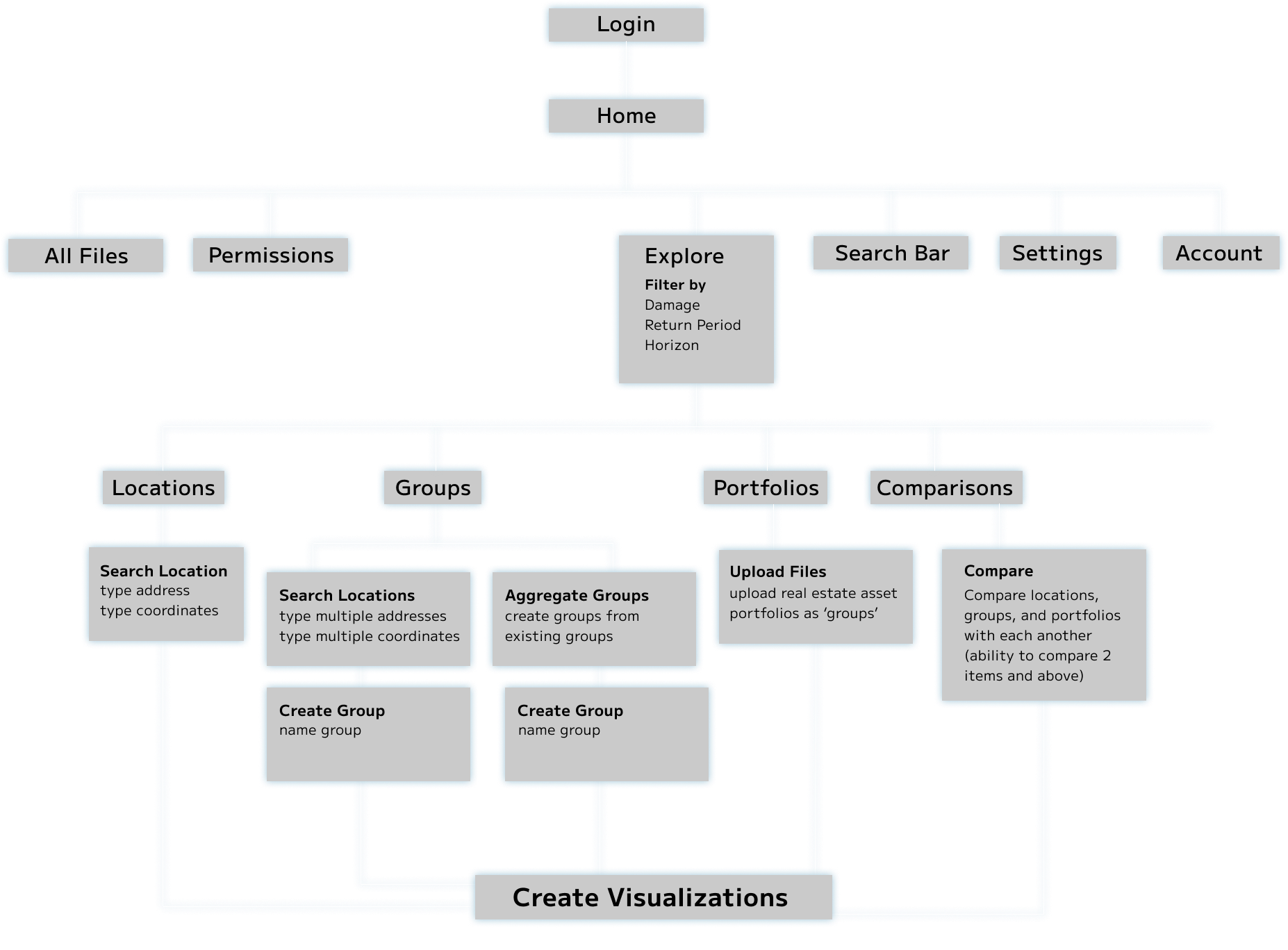
While taking UC Berkeley’s User Experience Design class, I was assigned to reimagine Google Sheets as a digital tool used for productivity. The first phase of the project involved conducting user research to obtain insights which I then used to brainstorm potential solutions. The second phase focused on feature ideation, prototyping, and usability testing before I finally arrived at my final prototype.


The first task was defining the target audience. I chose young professionals who use Google Sheets in a variety of settings, be it for work or personal use. I conducted 5 contextual interviews and collected 50 survey responses from users ranging from the beginner to expert level. I then summarized my findings.

key statistics

73% of survey respondents have used Google Sheets over the past month
60 % of survey respondents use Google Sheets daily for work
42% of survey respondents use Google Sheets outside of work

empathy map

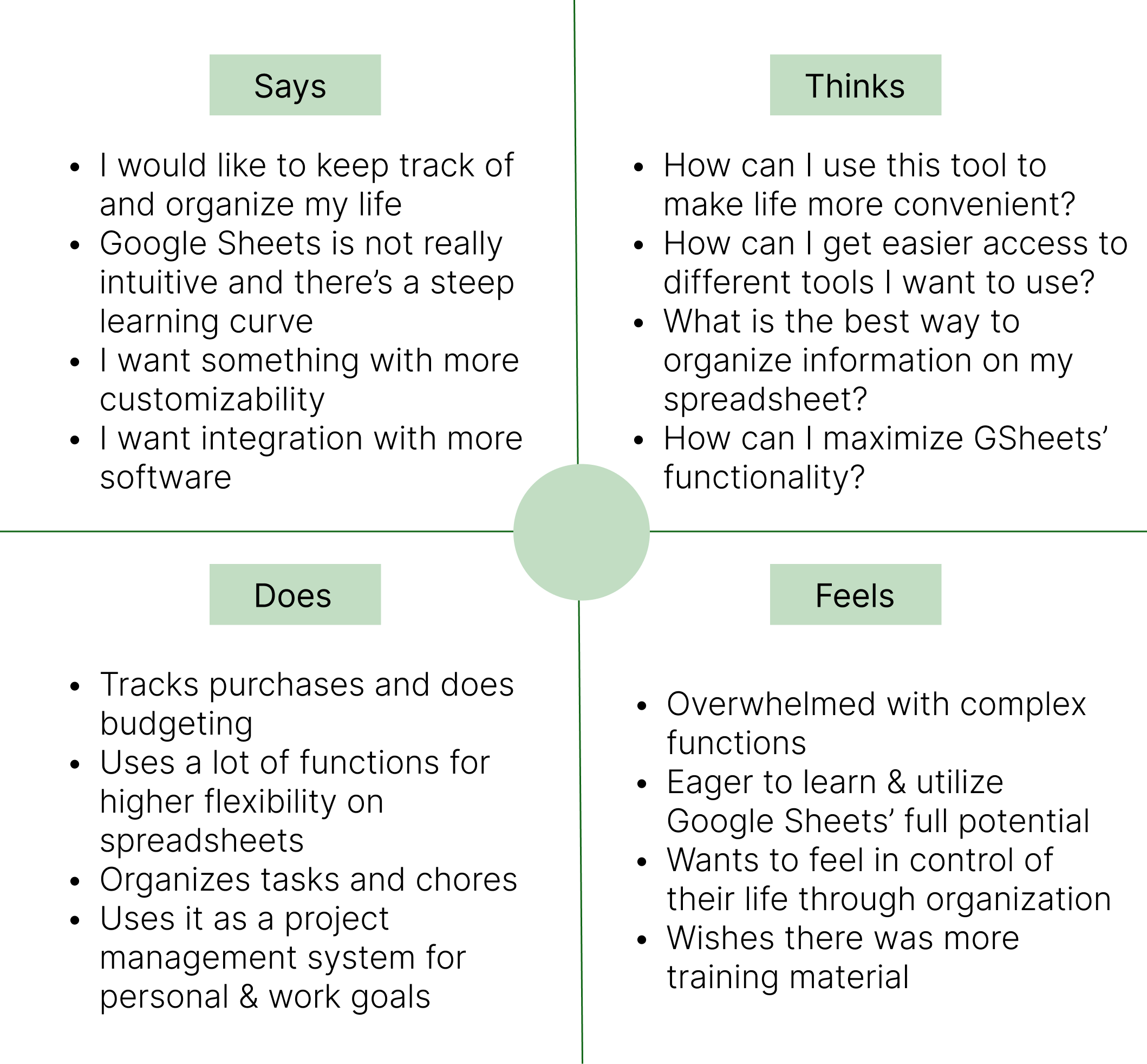
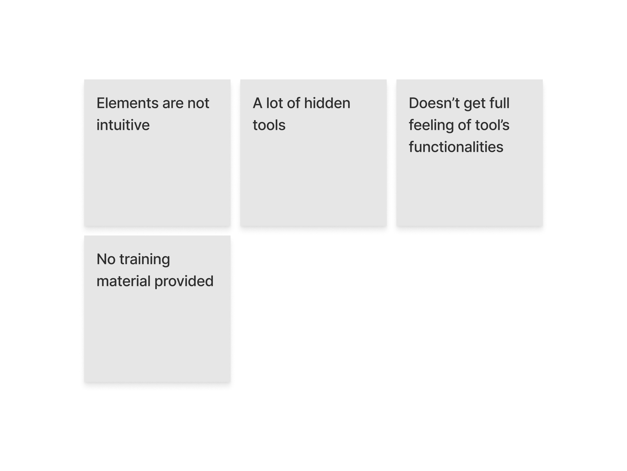
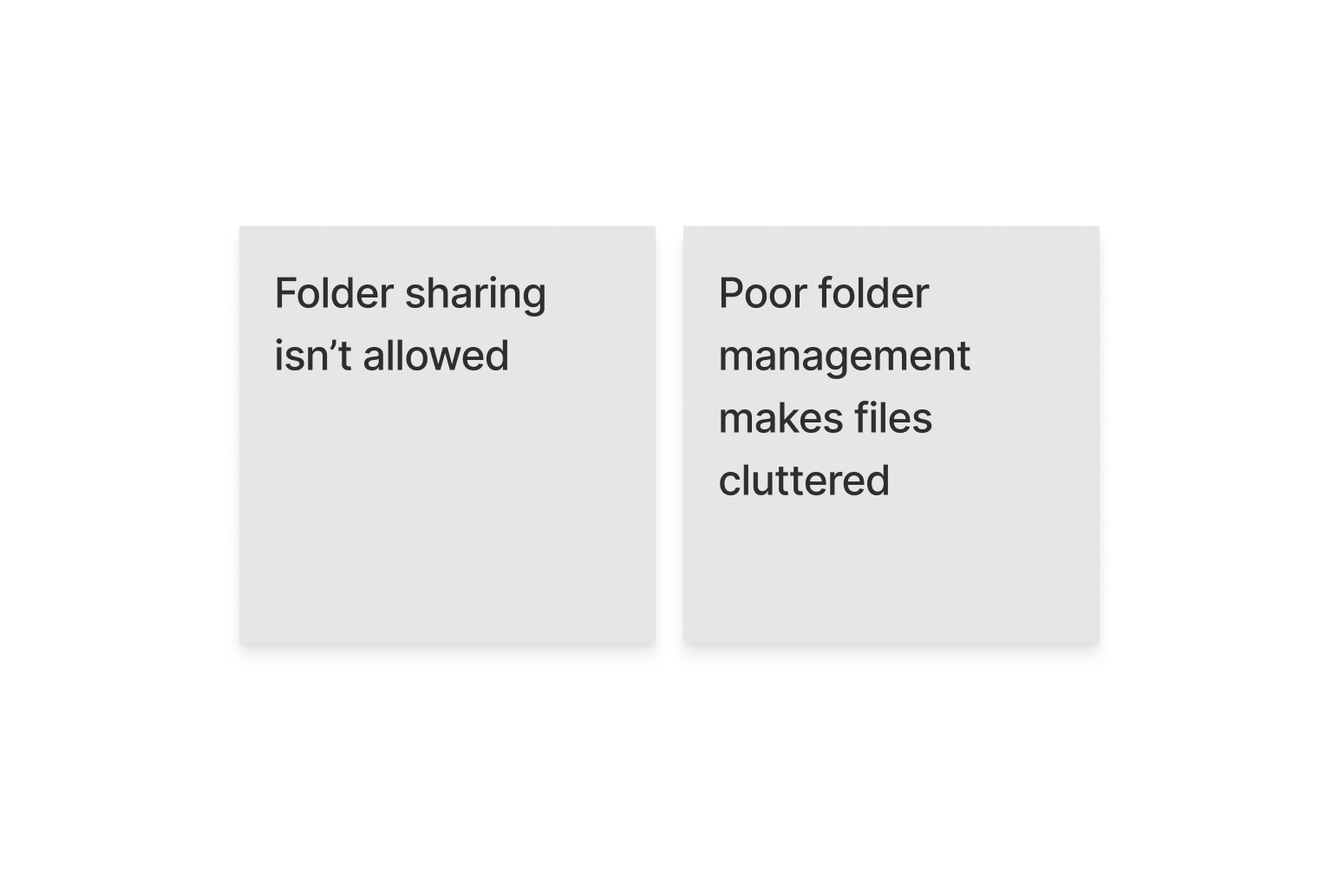
From my user research, I obtained some key insights that helped inform my design process.

discoverability

  • Beginner users felt that it was hard to maximize Google Sheets’ potential as it required a lot of self-teaching that most did not have the time for.
  • Google Sheets, Excel and other spreadsheet platforms require the use of complex tools in order to create relationships between different types of data, which tend to have low discoverability.

EFFICIENCY

  • Users stated that when they first started using the platform, they had to conduct extensive research and wished that there were alternative methods to build relationships within the database.
  • Experienced users were able to navigate Google Sheets with ease but stated that they would prefer simpler and more efficient methods when using the product for daily tasks and activities.

CUSTOMIZABILITY

  • While users felt that Google Sheets had a comprehensive list of tools & functionalities for a spreadsheet platform, they also stated that higher customizability for storing information would help increase productivity.

NARROWING DOWN THE PROBLEM

Design Process

1) FEATURE BRAINSTORMING

After deciding to hone in on redesigning Google Sheets’ organizational capabilities, I brainstormed various features that could be added or redesigned to the current user flow. I weighed the pros and cons for each feature and proceeded to sketch a rough user flow that informed my low-fidelity sketches.

2) low-fidelity sketches

When designing the low-fidelity sketches, I incorporated the new features in a way that integrated with Google Sheets’ current interface. While my redesign applied to various use cases, I decided to go with a scenario where a hypothetical user was trying to budget and used Google Sheets as a way to track their monthly expenses.

3) USABILITY TESTING

After completing rough wireframes for the ‘budgeting’ use case, I conducted usability testing with the people I previously interviewed and surveyed. After observing and gathering feedback, I identified the top usability issues and revised my wireframes accordingly. I conducted two more rounds of usability testing before I finalized my user flow.

4) FINAL USER FLOW

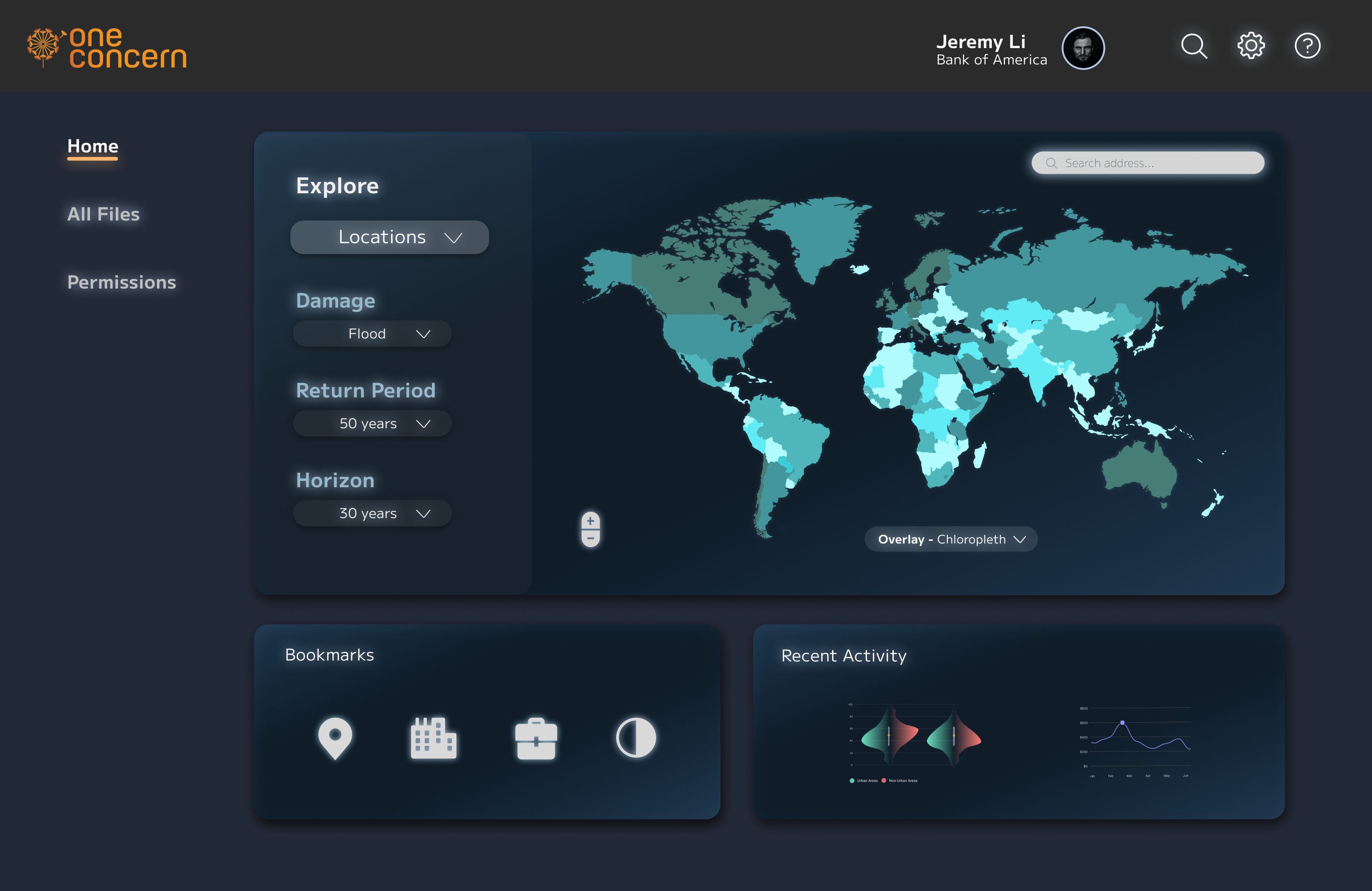
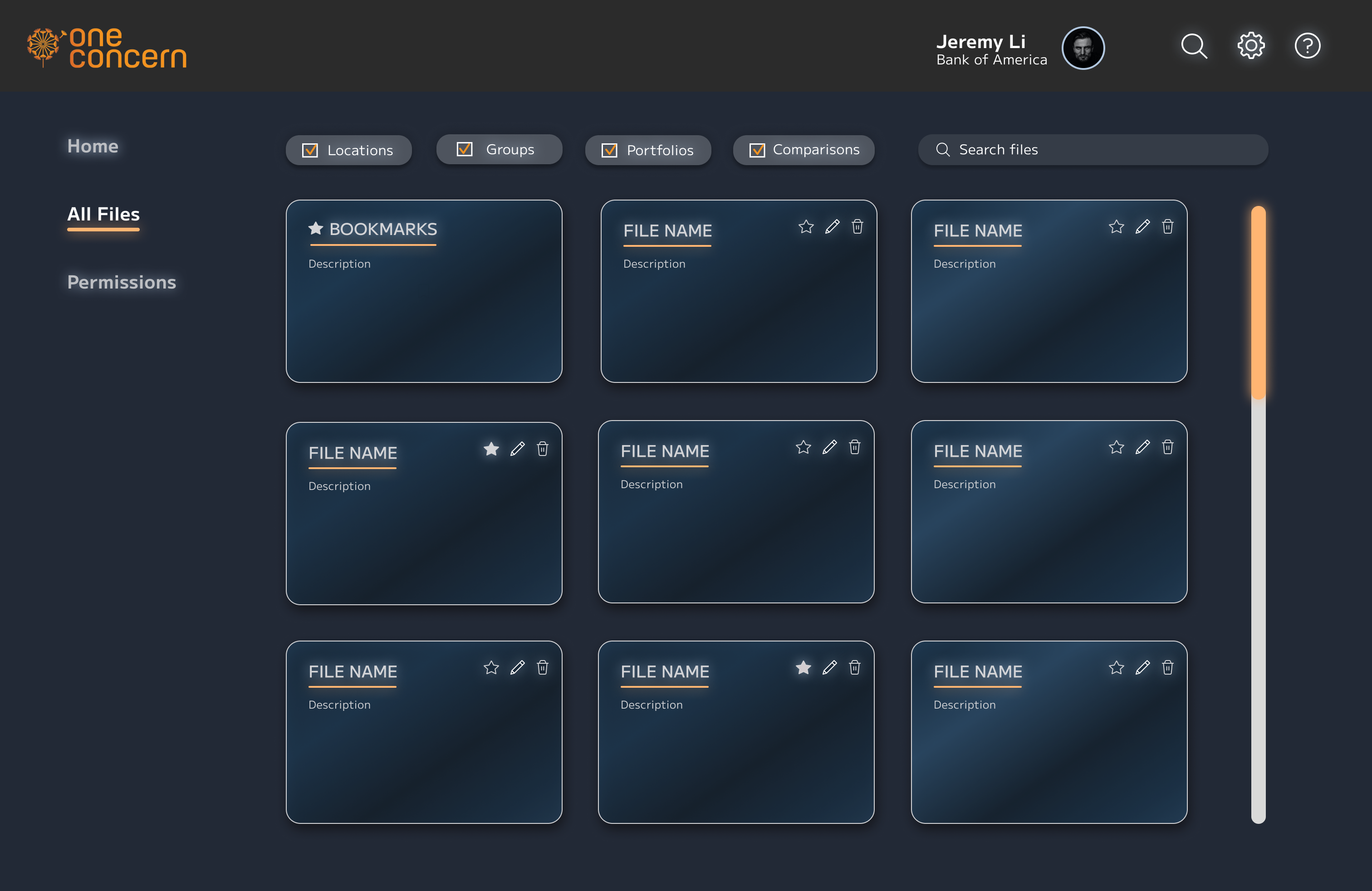
The final user flow below informed my high-fidelity prototypes shown in the next section. I also tested the usability of my redesign on other use cases to ensure that it was applicable and logical in other scenarios.

Solution

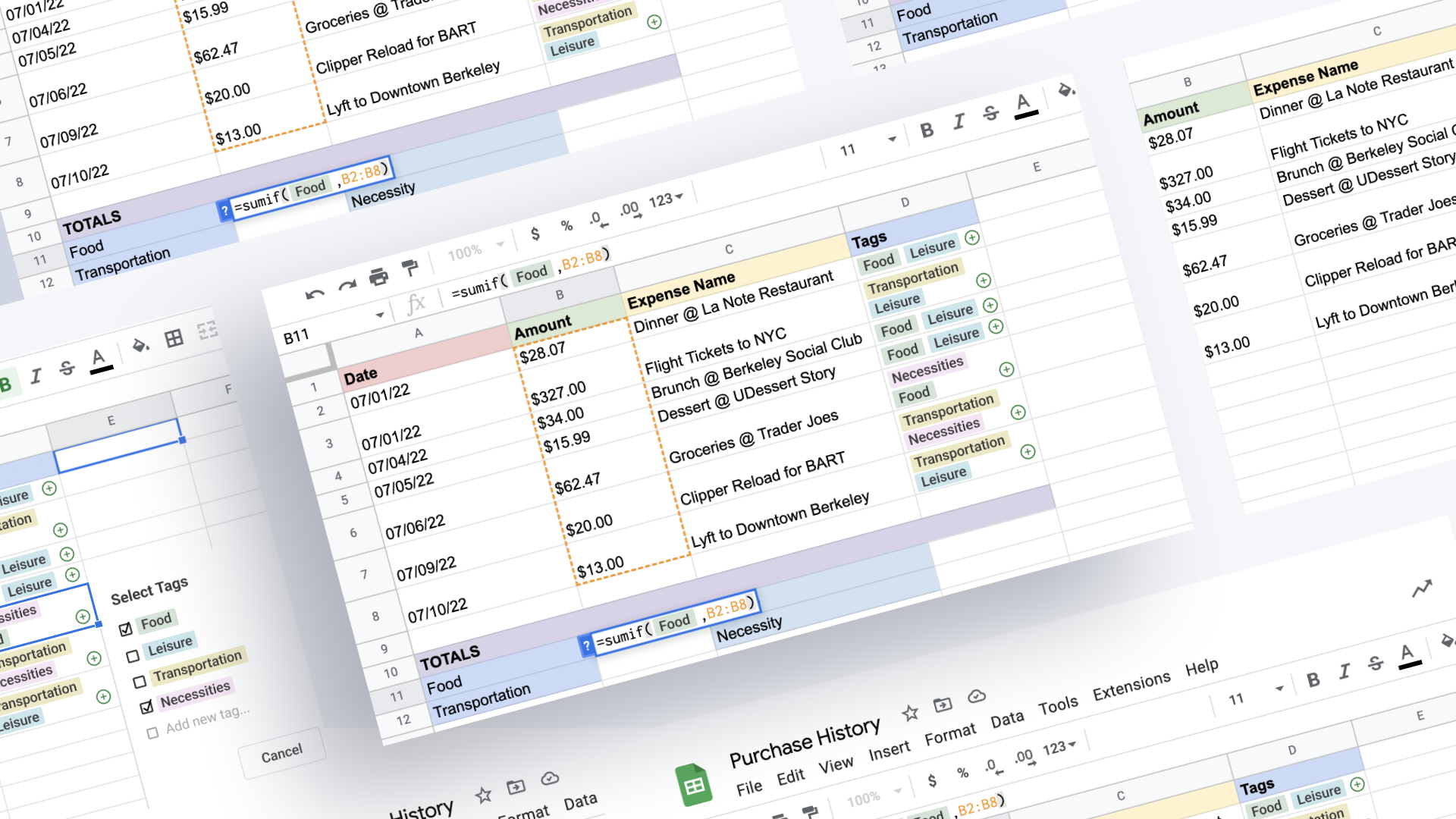
This is my proposed solution shown with a user who wants to track their spending breakdown from the previous month. To do this, they would have to categorize their expenses and aggregate values based on expense type. Below is a high-fidelity user flow of how this scenario can look like with my implemented reimagining of Google Sheets, broken down step-by-step.

Task 1 - Categorizing Expenses Using the Tag Feature

After the user has finished listing all expenses, they go to the ‘Tags’ column, which will be used for categorizing each expense in the spreadsheet. Once this column is highlighted, the user now goes to the ‘Insert’ tab and clicks on ‘Tags’, which will allow tags to be inserted in the desired cells. The selected cells are now populated with green plus icons, which signal that tag(s) can now be added to each cell. Since there are currently no existing tags, the user creates the ‘Food’ and ‘Leisure’ tags for the first expense. The same process is repeated for the remaining expenses.

Design Rationale - Discoverability

With GSheets’ current implementation, one would need to use Data Validation for categorization. Its main limitation is the inability to add multiple criteria in one cell. For example, the 1st row are under the ‘Food’ and ‘Leisure’ categories. In the current user flow, the user has to create 2 columns and apply data validation to both of them. While this method is fine for a small number of columns, it is inefficient for spreadsheets that require complex categorization. The Tag feature builds upon Data Validation by having improved discoverability for easier categorization.

Task 2 - Aggregating Expenses by Category Using the Formulas Feature

Once the user has finished categorizing their expenses, they now want to determine the totals for each category. To do this, they use the SUMIF formula and the tags associated with their corresponding categories. Let’s say the user wants to calculate the total amount spent on food. They first type =sumif( to indicate to Google Sheets that they will be using the SUMIF formula. The user then clicks on any of the ‘Food’ tags in the spreadsheet. This highlights all the cells that contain the ‘Food’ tag. They now select the range of cells which will be passed into the formula. B2:B8 is selected, which represents the column that shows the dollar amount for each expense. Once the formula is closed with the end parentheses, Google Sheets calculates and shows the total amount spent on food. The same logic applies to all other categories.

Design Rationale - Efficiency

In the current user flow without tags, the SUMIF formula is still used to aggregate expenses by category. The key differences between the current and proposed user flows are the number of variables passed into the formula and the way they are passed.

Old User Flow

New User flow

The tags' functionality extends to the creation of formulas. In the current user flow, one would aggregate expenses by category using the SUMIF formula in the following format:

In my proposed feature, only two variables need to be passed into the SUMIF formula: the tag the user wants to filter by, and the range of cells to be aggregated. This saves a lot of time as the user can now simply click on the tag instead of (1) specifying the range of cells from which to look up the category and (2) typing in the category with double quotation marks. The new user flow is 5 seconds faster than the old one and as these differences compound, a more efficient way to Google Sheets' current implementation is ideal.

Task 3 - Changing, Editing, and Customizing Tags

A user also has the ability to change tag(s) in a cell. In this example, the user has wrongly tagged the expense ‘Lyft to Downtown Berkeley’ as ‘Leisure’ instead of ‘Necessities’. To correct this, the user simply clicks on the ‘Leisure’ tag. The pop-up window appears where the user has can uncheck the box next to the ‘Leisure’ tag and check the box next to the appropriate tag.

Additionally, the user has the option to customize and edit tag(s) to their liking. To do this, the user clicks on any tag. A pop-up window showing all the tags used in the spreadsheet appears. Each tag has three dots next to it, which will enable the user to rename the tag or change its color.

Learnings

As an economics student who uses Google Sheets extensively, I thought that this project would be a good exploration of information and spreadsheet management. The challenge for me was taking all the user research I conducted and forming a tangible solution to address user pain points. As Google Sheets is an established platform, ideating features/feature redesigns required a lot of thoughtful evaluation. My designs needed to be familiar enough to the trained eye yet still intuitive for the beginner user. The design also needed to integrate seamlessly into Google Sheets so the features didn’t feel like they were from some other platform but rather augmented the platform's functionality. During the design process, I came up with features that had lots of potential but eventually had to narrow them down to the ones I thought would address user pain points in the simplest way. These features also needed a lot of refining and I spent a lot of time iterating user flows after numerous rounds of usability testing. This was one of my favorite projects and I really enjoyed the process that led me to my proposed solution. I would definitely revisit this case study in the future and expand it even further.